
Penn State University Park is ranked 47 on the list of national universities by USNWR. Many state universities have similar "by the numbers" admissions standards, but most do not broadcast them in such a straightforward fashion as Penn State does.
Here is their explanation:
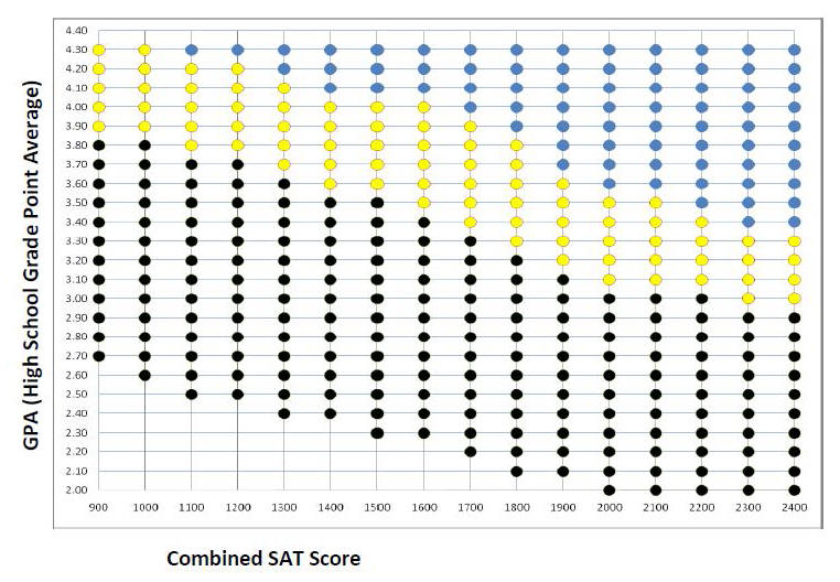
To use the graph, plot the student’s cumulative high school grade point average and best combined SAT score from a single test date. The scale used is based on a 4.0 grading system that takes into consideration weighted grades. Based on the color of the point where the GPA and SAT score intersect, you can use the key below to estimate the student’s likelihood for admission to Penn State.
- BLUE - The student is likely to be offered admission to his/her first choice of Penn State campus, including University Park.
- YELLOW - The student is likely to be offered admission to a Penn State campus other than University Park. Additional review would be needed to determine eligibility for admission to University Park.
- BLACK - The student is likely to be offered admission to a Penn State campus other than University Park. Additional review would be needed for specific campuses and/or programs.
http://admissions.psu.edu/info/counselors/bubble_chart.pdf
Related: A CollegeConfidential discussion on this chart
Related: A CollegeConfidential discussion on this chart
No comments:
Post a Comment